At StoryStream we like to share insight into our design process. We do this because, not only are we proud of what we do, but we believe sharing our experience can help other people trying to solve similar problems.
This year we spent Q1 reviewing the performance and plans for our Storyboards, the out-of-box content displays that our customers rely on to power their customer experiences across websites and mobile apps. As part of this process we gained a lot of insight from a cross team design thinking session.
We believe anyone can have a good idea, the question is how do you get good ideas that actually help your business.
First off, let us clarify what we mean by ‘Design Thinking’, for us, it’s a process that takes you from problems, to ideas and solutions with the user’s needs at the center of every decision. Generating lots of great ideas is one thing, however, forging ideas that solve existing problems and in turn improve the experience for users and the company, requires a certain methodology. In this article we intend to guide you through what our recent session here at StoryStream looked like.
The Task
The task set was simply to “Improve our Storyboards”, which would include all elements of visual aesthetics as well as performance optimisation to drive better user engagement and conversions.
What we needed:
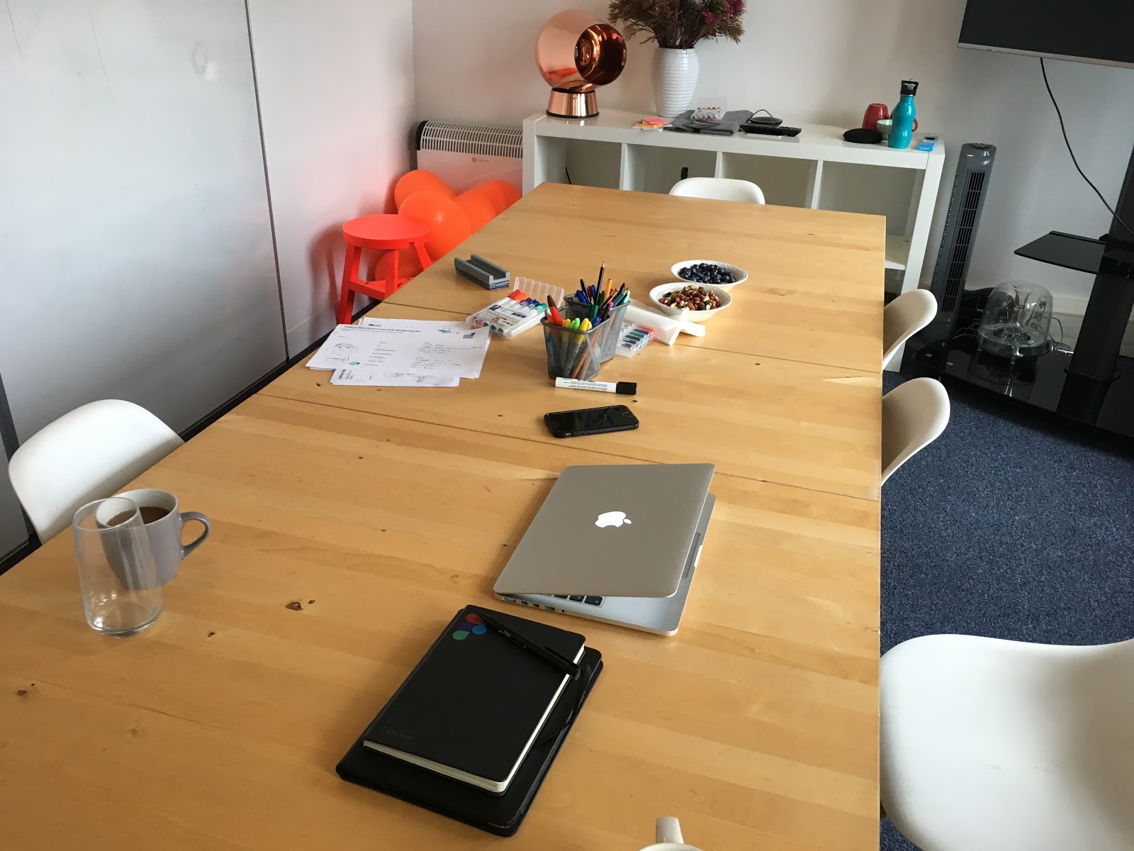
- A room -big enough to comfortably host a group of up to 7 people, ideally with a whiteboard.
- Snacks – we prefer it if our team isn’t thinking about brunch whilst trying to come up with ideas so we provided some bowls of nuts and berries.
- Stationary – we provided pens, pencils, rubbers, paper and post-its.
- Our product – A MacBook, iPad and phone, each with one of our Storyboards preloaded for everyone to view
Preparing the session
We prepared our workshop roughly 1-2 weeks beforehand, this allowed time to determine which team members could be involved and then book a time and place.
Choosing the right people is an interesting challenge, you want to balance how much time it should take against how busy people are but still include the right mix of experience. For our task we decided on roughly a 3 hour workshop with company experts. We took a leaf out of the “Design Sprint” book by Jake Knapp and looked for these people:
- Designer – mostly likely to be you
- Tech/Logistics – who best understands what you can build
- Marketing/Sales – who sells what you will build
- Customer success – who knows you’re customers
- Decider – who makes decisions and knows the company roadmap
- Troublemaker – if possible include a troublemaker, someone who can have differing views and then back them with strong arguments.
Next we decide what tasks to include and the detail we should go into for these tasks. We based ours around Marvel’s design workshop guide and adapted it for our session.
- Empathise
- Persona’s
- Daily routine map
- Define Problems
- Journey Mapping
- Prioritise problems
- HMW’s (‘how might we’ questions)
- Ideate
- Post-it sketching
- Present ideas
- Vote concepts
We ran a quick test workshop to identify if there were any potential hiccups, we found that dot voting problems was too advanced and we could get by with simply debating and moving problems above or below each other.
The Workshop
Let’s Start with Empathy
Our Storyboards need to provide value to our customers, but in turn need to provide value to their users, which may not always feel like the same thing. However, ultimately, a product’s success is not determined by its features but by what needs it meets for people, therefore we focussed this session from the users perspective.
This stage is crucial to helping our team use our product whilst standing in the user’s shoes, ensuring the problems we discover are their problems, not ours. This stage can be quite entertaining.
We provided partially completed persona’s that each team member could fill in. Some of the information was based on data we already knew, for example that 40% of users view our Storyboards on mobile device. In order to simulate an authentic experience we also explored a typical day for each of these personas and included a touchpoint in that day where they interacted with our product.
Each team member then spent 2 minutes reading out their persona in the first person so that we were all roughly familiar with each others new identities.
Journey map
Now that we have gotten inside the users heads, we can begin to uncover their problems. We broke up the journey for a user into a number of interaction stages:
- First glance at content
- Hovering on content items
- Clicking / tapping on content
- Viewing a content item in fullscreen

We considered what the user is thinking, their happy moments and pain points for each phase above. By filling in these blanks from the mindset of our newly adopted personalities we were able to outline genuine pain points that needed to be fixed. For more information on Journey maps read this.
Prioritise problems
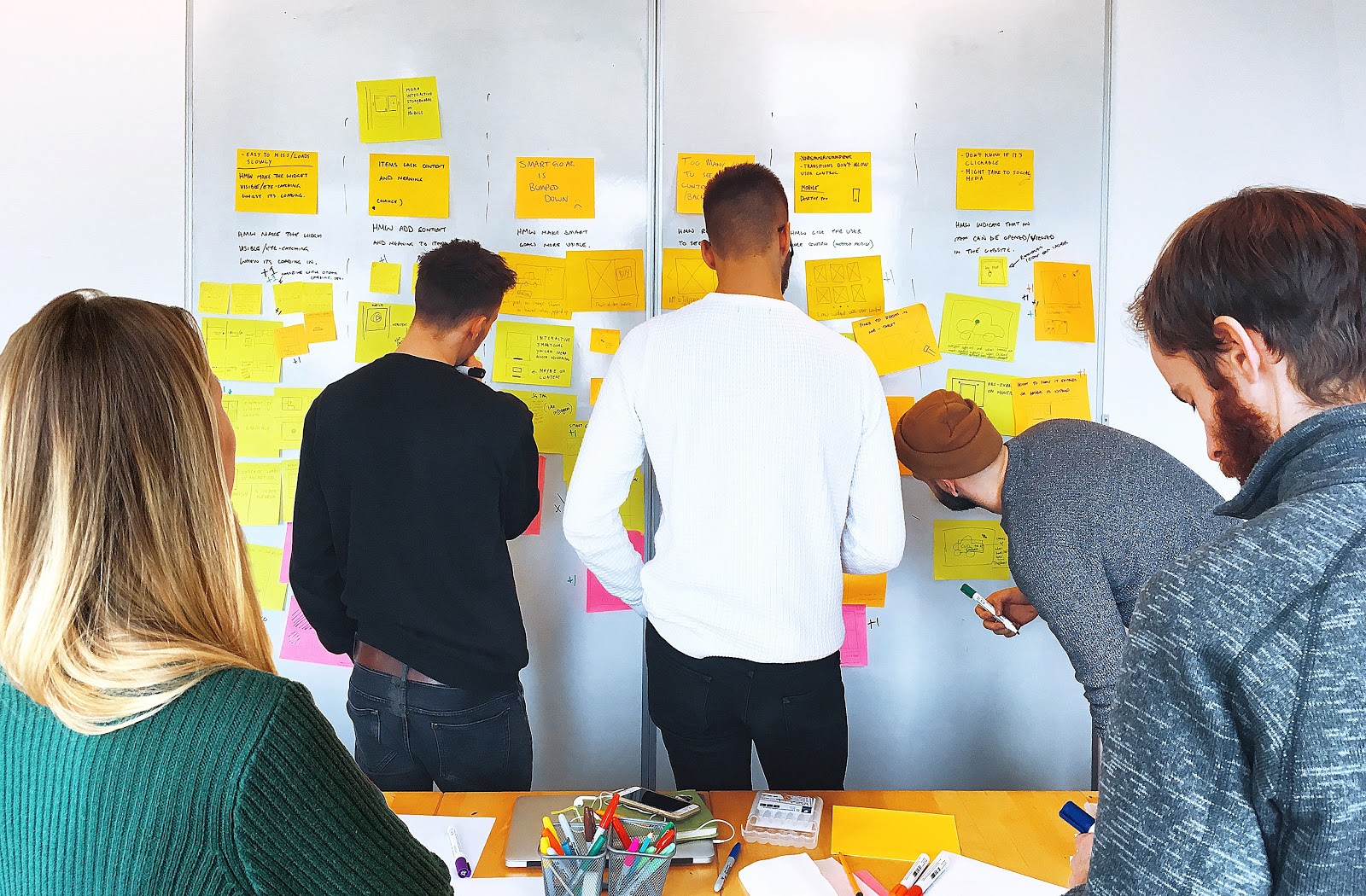
In order to save time the whole team wrote down all the problems clearly on post-its with each person assigned to a column on the journey map. The designer who was facilitating the session read out each problem and stuck it onto the whiteboard, repeating this task and adjusting as we went, we ordered the problems from top to bottom in priority.
We then drew a line below the top six problems as those were the ones we would focus on for the rest of this workshop, this lets the group focus on the crucial problems and the designer can approach the rest in his own time.
HMW
It’s normal to feel overwhelmed at the sight of these big problems that need solving so we use a technique called HMW (how might we). It’s a simple method for framing problems as questions, here’s an example:
Problem: Sliding images and text transitions prevent the user from controlling what image/text they want to see.
HMW: How might we give the user the ability to see exactly what they want when they want?
We find that this simple twist can make problem solving more approachable because psychologically it’s less cognitive load to simply answer a question.
We stuck the top six problems evenly across the whiteboard and as a group turned each problem into a question.
Concepts
This is the meat of the session and where some really innovative ideas can be conceived. The goal is to come up with as many sketched concepts as possible that solve each problem.
We like to sketch because when the concepts are reviewed, it is far easier to understand a diagram than an idea in writing. We like to combine the sketches with a title and any useful annotation.
Sketching can be a daunting task for anyone, therefore a neat trick can be drawing onto a post-it note, this indicates that it’s temporary and appears less intimidating than a large blank A4 paper.
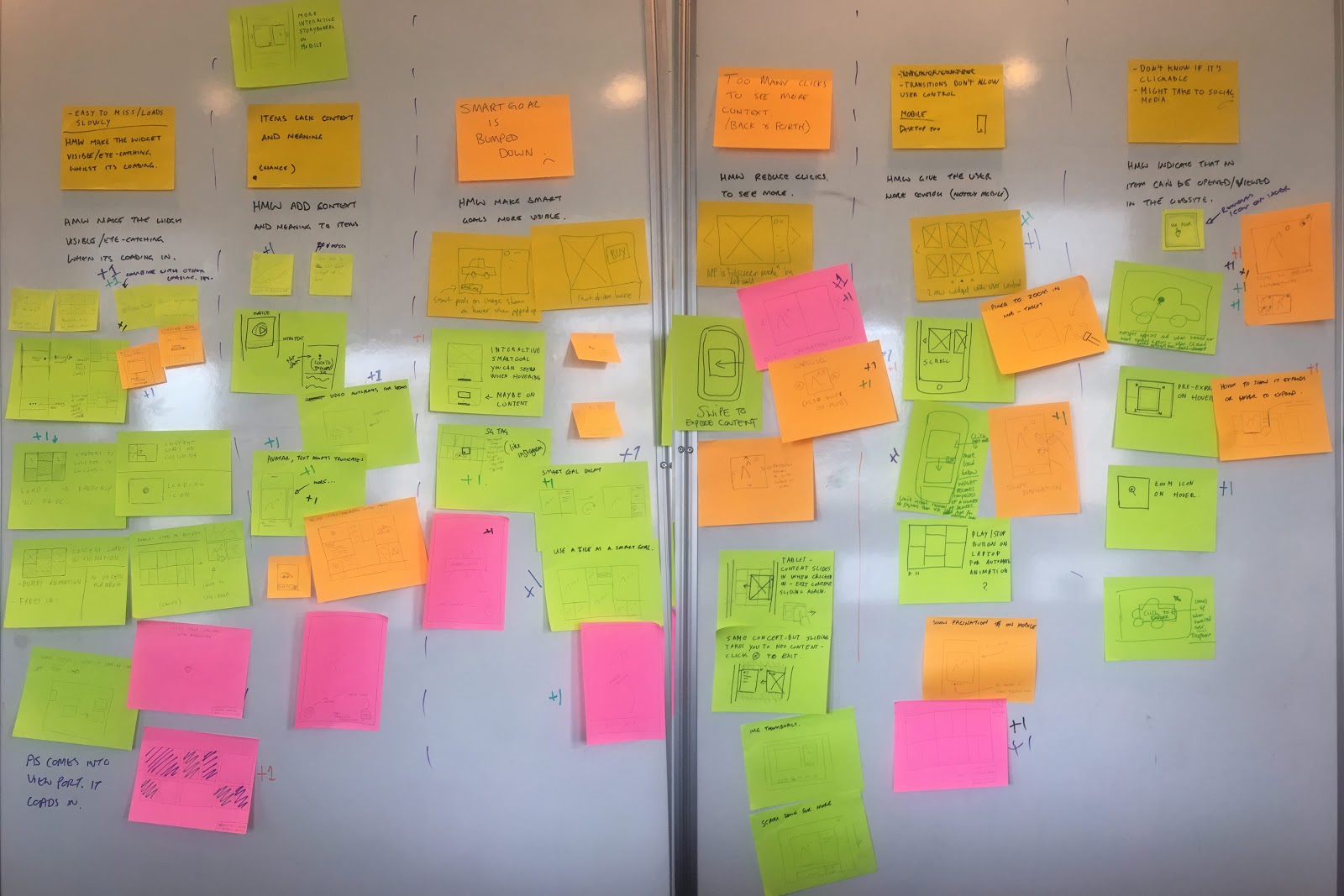
After each 5 minute concept session we would stick all of our ideas on the whiteboard below the problem being answered. Within 30 minutes we had a whiteboard brimming with innovative ways to improve our product!
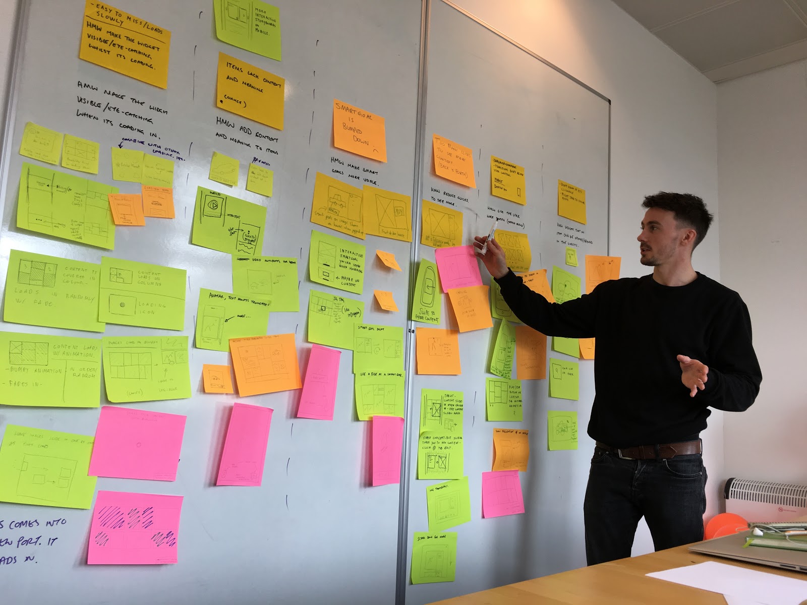
Present concepts
Looking at the wall full of designs we found a real sense of accomplishment mixed with excitement, especially knowing that we were solving real problems in such a short period of time.
Vote
There are many methods for voting, but due to time constraints and for simplicity’s sake we allocated each person a marker and a single vote per problem. This made the team think very hard about their vote and they were allowed to vote for their own solution. This vote is not essential as there are many limitations in design, it’s more for a sense of guidance toward a preferred solution.
At this stage we had a quick look at the votes and then concluded the session in good spirits about what we had achieved within 3 hours.
The results
So what were the results? This process and the direct voice of our customers gave us huge insight into what we needed to prioritise and build next.
We’re very happy to say that the first new features to come from the process have been in development and testing for some time and will be rolled out to our customers very soon throughout April and May.
Stay tuned for our next Product Newsletter and product blog post where we’ll begin to announce these officially.
Thanks to
Thanks to Marvel for their brilliant workshop guide which you can view here.
A shout out to Jake Knapp for his book “Design Sprint”.
